Showing posts with label bulbous. Show all posts

Saturday, February 28, 2009

The Surplus of Kurt Angles Situation

As some of you may know, I met Kurt recently.


This was fun. Kurt now owns that little watercolour. I think he wanted to put my name on a gold plaque. He kept reading it out really loudly.


Kurt settled as a logical muse between working in a shop and practising cartoons.

He always has been magic.


This one began as a phone doodle.


Friday, June 27, 2008

joy of chalk

Now this is a bit more fun, if not actually less stupid.


I have some pastels now, but most of the colours are a bit full on. They are probably better in the long term in conjunction with more sobre media, but when you have something new, you gotta make a mess with it.

Friday, February 15, 2008

Men and their Heads and my Line Frenzy

Here are some pictures that say unto you that I still draw wrestler heads.

This one's from ages ago. I did it whilst watching a whole episode of What's New Scooby Doo, which isn't a very good thing. But I wanted to know who did it.


And these were done in preparation for an illustration that ultimately went in a letter to Mick Foley, illustrating my concerns about how John Cena might respond to my depictions of him.


And this is a video of a caricaturist called John Kascht drawing Rudy Guiliani. I liked watching him draw and his descriptions are as eloquent as his drawings. It made me realise I draw in quite a frenzied way... professionals are smooth. There's a link to his other videos drawing the other candidates on the right.

Wednesday, April 04, 2007

Where's Arnold? I wonder if you can find him.

This all looks a bit of a mess, but I think I'm learning that the best and most organic ideas often sprout from this kind of mess.

Doing these little wild thumbnails seems like quite a natural part of the process to me.
Can you spot Arnie?

An offended spotty cat?

(It may help to click to enlarge)

An erumpent green rump?

Some stinky carthamus pink?


The carthamus pink I got in a sale at Herrings, the art shop in my home town Dorchester. The tube looks like it's from at least as long ago as the seventies. And heavens it's stinky stuff.

Sunday, February 04, 2007

John Cena is A Bump-Lunk!

Maybe that doesn't quite rhyme with 'erumpent' like I wanted it to... never mind.


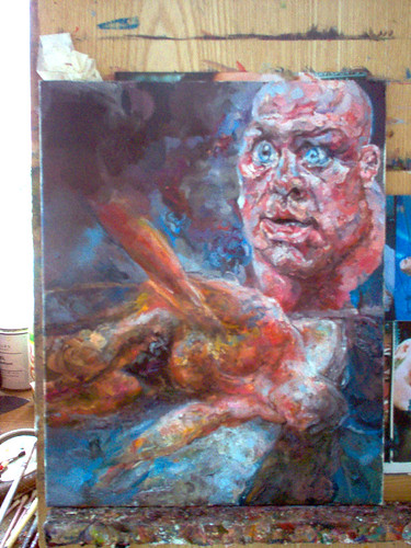
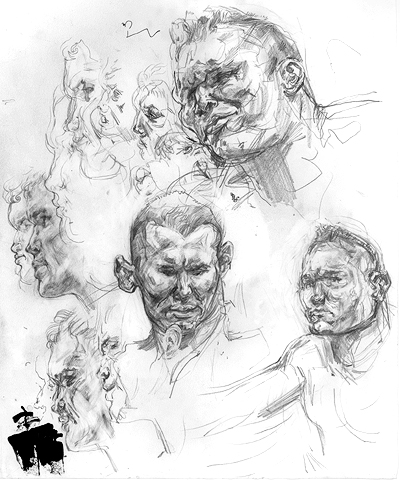
I've been suffering for my art... I just said 'Right! If I'm going to draw John Cena, I'm going to do it properly.' I had been floundering in indecision, but now I was going to make the sacrifices necessary to see this task through.

But sifting through the reference material was not always easy on the peepers.

john cena flat top crew cut

(I also referred to this problem on my wordy blog)

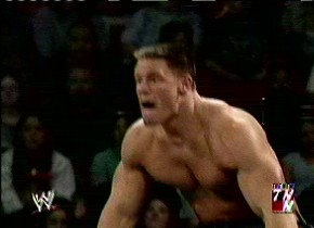
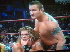
Bless his big flat topped rectangular foam wax head.


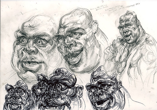
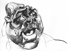
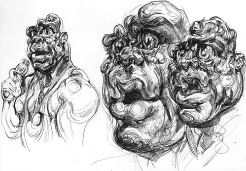
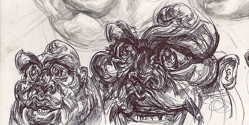
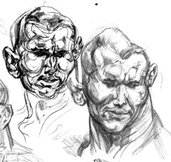
With this subject, it was kind of a case of 'You can't spoof a spoof'... I actually found it quite hard to get the drawings funnier or more strikingly extreme-looking than the original.

Or... to capture some aspect of the uniqueness of the original and play on it til the cows come home.

He does look sometimes like his arms are on backwards. And that's not the only feature he has in common with Fred Flintstone.


In the past I compared Cena to Poochie from that Simpsons episode that parodied focus-group thinking. Well, that was a little bit unfair. Even though it was true. Cena's designated wrestling persona did in the past make him into an extremly undignified human vehicle for the most unedifying corporate version of the 'tude' that John K described on his blog recently....

But he's a good stick really, is Cena. Watch him fly!


In real life, he appears to possess no 'tude, no pride, vanity, shame, grace, or feminine characteristics. He's also a walking epitome of 'uglycute'. Well, I say 'walking'... he doesn't appear overly good at activities that involve coordinating more than one limb.


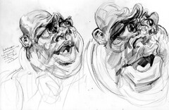
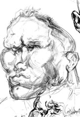
When I do these drawings, I start off comparatively careful, with my observational head on...


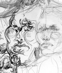
But then there comes a stage where I'm suddenly faced with a plethora of possibilities... oh no!


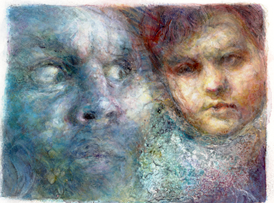
Sometimes when I feel I'm gaining control, it makes me feel drunk with power... other times indecision leaves me befuddled. What is my ultimate aim? Moody intense paintings? Cute lighthearted cartoony designs? Involved, extreme caricature? The ability to draw Cena from memory? A striking image for a myspace comment (that's slightly depressing..)


A lot of the decision seem to boil down to 'mood'. Do I want to do something joyful and silly, or something that caters to all my high faluting serious propensities...

Not that the two things HAVE to mutually exclude each other, it may be like a continuum... or it may be that I have to find a way to be serious while infusing my pictures with joy.


I have said that I find it possible to 'get past' a subject and into my own intent once I learn the subject really, really well.

Well gosh I'm having fun with this for the time being.

P.S. apologies to John C and his friends and family, I didn't mean to be mean or anything. All insults are delivered with affection.

, , , , , ,

Saturday, January 06, 2007

Peat Brown Muzzlebulbs

Well....

I've done lots of drawings but I've been scared to show them... well not scared, but I was trying to work up to some kind of 'culmination'. I'm sort of in a process of deconstructing and reconstructing my whole picture-making process, so a lot of what I have been doing is really 'pieces' or parts and not the assembled whole.

I had fun when I got out my dip pen and some ink that calls itself 'peat brown'.


You see, Edge and Randy Orton are a tag team now. I still love Randy more, but they are quite visually comical and homo-charged and pleasingly similar in height and bulbousness, so I thought I'd make hay while the wrestlesun shone on this partnership.


So, eventually I thought I ought to colour something in.

I did this just before Christmas, I was listening to an Old Time Radio production of A Christmas Carol with Lionel Barrymore as Scrooge and Orson Welles narrating.

I'm getting the hang of controlling my colour, but trying not to be overly anal about aforementioned control.


I got the likenesses a bit better in this one possibly, but the composition is nothingy and wrong:


Here's a sketchbook page with some connected scrappy little thumbnails. If you look at the text there's some of me documenting my hurt feelings about the received wisdom regarding 'contemporary art'. the text is eighteen months older than most of the pictures.

But that's quite fun, looking at the frictions and congealings between new picture thoughts and old word thoughts.


When I was on my little Peat Brown adventure, Edge the wrestler eventually and quite according to the whims of nature, turned into a cat, and his gigantic chin became merely a muzzlebulb.


Wednesday, June 14, 2006

Everybody loves me! I'm freakin' adorable

This week I have been intent on capturing the wrestlery thumb-like pink cuteness of Kurt Angle the wrestler.... with varying degrees of success. (The title of this post is something he once said.) I think I’m building to something. I like doing at least two people on a page. Peoples’ faces are so gorgeous and so ridiculous. It’s nice to have two in order to milk the comedic and miscellaneous chemistry that occurs between a pair of mushes.

I’m also still a beginner at this caricature business, and I haven’t quite figured out what I ultimately want from it, apart from the obvious cheap thrills. Now let’s see….


The above page was my breakthrough page. I think a key factor is the regrowth of Kurt’s eyebrows (in real life) after several months of overzealous silly plucking. They add a lot to the expressiveness of his face, and it was his distinct expressions that helped my Kurtify my Kurts in this instance.

The big one on the top left ended up looking more than somewhat like Slimer from the Real Ghostbusters. I regret this a bit because Kurt is cute. But he does have a big rounded intense manface.

The demonic gargoyle biro one in the middle at the bottom looks nothing like him really, but I liked the way the process was taking on its own momentum and getting towards some way out places.


Then I noticed that the problem is a cartoony Kurt gets a little bit Disney. Like a cute Disney goblin sidekick. That didn’t interest me.


Nope, still in loveable babyman territory…

I felt I almost had to go wilfully nuts at this point, or try to see him anew. To get a bit bad at drawing or a bit very good. I got a little somewhere.


I wanted to try to get across some of the startling bigness of his eyes without them getting too… obvious.

It helps to include the bod.


Kurt’s big pink wide eyed neckhead has even found its way into pre-existing oil paintings. He looks like he’s just fallen in love! (This isn’t finished.)


Next time: Stuff that’s not Kurt!

Here’s a bit of a preview of something else. It’s a very poor blurry photograph of a hermaphrodite Ric Flair Britney Janus Wind God detail from a nearly finished epic landscape painting.


I love all your comments and interest and stuff.

Saturday, April 22, 2006

Handsomeness Engulfment

One post on its own on a new blog looks completely sad and depressing, I’m going to have to cheer this thing up a bit.

And I already got some feedback so I’m getting hungry for attention now. I shall turn into a blog monster.

I’m going to have to just tell you now: I draw wrestlers a lot. And paint them. I’ve tried to explain aspects of my fascination with wrestling before, but here’s for pictures. (if you click on any of these you can see the whole page that they come from at a nice big size):


There are some Randy Orton studies. In which Randy becomes engulfed by his own voluminous handsomeness. I understand his face so much better now!

Lots of faces. I get obsessed with faces and neglect to give them bodies. There'll be more whole people in some new compositions soon I think. Need to get as obsessive about manipulating space as I am about manipulating FACE.

Here are the wimpy wussy conservative studies that the manly cartoony drawings are derived from:


And here’s a painting based on terrified Randy's face and a young sad looking Meatloaf (on the set of The Rocky Horror Picture Show, I believe):


That one is a tiny tiny painting, it’s only ten centimetres across or something. It was painted in controversial combinations of acrylics and resins and varnishes and watercolours followed by oil glazes.

My Granny liked it but she asked my why I have to paint sad things.

I might even post some more drawings if I have done anything worth seeing by the end of today. And bring this thing bang up to date.

This blog and my other blog and everything in the world looks better, prettier and more dignified if you view them through Firefox.

Related Posts Plugin for WordPress, Blogger...