Saturday, February 24, 2007

Nature's Colour is Most Beautiful if we can but see and understand it

I haven't got a nice neat little collection of pictures today, partly because I'm trying so jolly hard to get better at everything. Yesterday following the suggestion of Bill Wray in the comments, I found these lovely mostly out-of-print books by Andrew Loomis, online in their entirety.

Originally I wanted instruction on perspective, but these books cover a lot more. Absorb! Wondrous free resources for those who crave knowledge!

Click on the image to find the rest of the book 'Creative Illustration':


I was thinking that maybe could write more on this blog about who and what I'm trying to learn from.... and why.

I like these books' extreme heterosexual male 50s-ness. I like that it's about 'commercial art'. It could bee seen to be a nice counterbalance for my silly-headed womanly English hippy tendencies.

I also like them because the author seems to genuinely care about teaching well.... communicating... in the clearest terms... but he has his own voice, he's not bland. I like it when people speak their own words.


Perhaps the only reason I ever didn't want to be 'an illustrator' was the crapness and mundanity of a lot the stuff I saw at illustration degree shows etc. Doing fine art seemed... well it's more glamorous, but that wasn't really it... it was more challenging, I could sense the frictions I was in for. Unfortunately they weren't so much sexy frictions as a nasty cultural labyrinth of poo, from which there seemed no escape.

Luckily now I have clear-headed mid twentieth century American chaps to help me into the land of sufficient competence. Screw postmodern cynicism, bugger ambiguity and 'interestingness'-masturbation.... Enough questions! I want answers! I think I'm entitled! I can handle the truth! I want to be good! I believe in truth and beauty! Gsaahh!

Remember the five Cs!


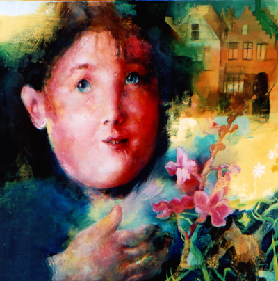
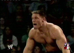
As I haven't assembled any sort of pictorial thesis of the crisp 'John Cena is a Bump-Lunk' calibre (but I'm working on it), I have a teaser picture, it's some boobies I painted with oil paints. The painting also has a head in it. I'm getting back into oils, gradually, between frenzied drawing sessions.


Tuesday, February 20, 2007

Foreshortening as modelled by Stephen

Today's a bit of a higgledy-piggledy hodgepdge and a indeed, hotpot of a post.... some of my messy concept thumbnail type drawings and some kitty action. It seemed like a good idea at the time.

Stephen was sleeping on my computer chair, so I picked him up (which is not easy) and plonked him on my lap. To my surprise, he stayed in exactly the position I left him in, flat on his back. He is so massive that I couldn't photograph all of him at the same time.


I have this photo of a graveyard in the village I used to live next to, and I really want to paint it. But I'm as yet unsure as to how I want the perspective to go, how cute I want to make the lines, and whether I'll put anything in it. Putting wrestlers in it feels a little contrived. And sort of vulgar. But how does a person judge these things? Painting pictures is a funny business.


Stephen has no suggestions.


Who's up for a fight? Bunnies and minotaurs?


It seems necessary to the congealing of my ideas to have these loose deranged pages in which elements can come together of their own accord.


One thing that's changed lately is that I'm trying to get a proper handle on perspective, because I was never taught it properly, yet I'm quite a fetishist for geometric tricks once I get into it. (See the new link on the right, to a very thorough page about perspective.) I used to try and convince myself that I was happy 'feeling things out' painting in quite a shallow, retarded pictorial space... but now I want to gain as much control as I can over these elements and not leave things to chance.

Here's an old painting with a nice feeling but no regard for perspectival depth at all:


But Stephen gives me lessons in dynamic perspective... in fact I've been studying kitty anatomy quite a lot. That's for a future blog.


Tags: , , , , , ,

Sunday, February 04, 2007

John Cena is A Bump-Lunk!

Maybe that doesn't quite rhyme with 'erumpent' like I wanted it to... never mind.


I've been suffering for my art... I just said 'Right! If I'm going to draw John Cena, I'm going to do it properly.' I had been floundering in indecision, but now I was going to make the sacrifices necessary to see this task through.

But sifting through the reference material was not always easy on the peepers.

john cena flat top crew cut

(I also referred to this problem on my wordy blog)

Bless his big flat topped rectangular foam wax head.


With this subject, it was kind of a case of 'You can't spoof a spoof'... I actually found it quite hard to get the drawings funnier or more strikingly extreme-looking than the original.

Or... to capture some aspect of the uniqueness of the original and play on it til the cows come home.

He does look sometimes like his arms are on backwards. And that's not the only feature he has in common with Fred Flintstone.


In the past I compared Cena to Poochie from that Simpsons episode that parodied focus-group thinking. Well, that was a little bit unfair. Even though it was true. Cena's designated wrestling persona did in the past make him into an extremly undignified human vehicle for the most unedifying corporate version of the 'tude' that John K described on his blog recently....

But he's a good stick really, is Cena. Watch him fly!


In real life, he appears to possess no 'tude, no pride, vanity, shame, grace, or feminine characteristics. He's also a walking epitome of 'uglycute'. Well, I say 'walking'... he doesn't appear overly good at activities that involve coordinating more than one limb.


When I do these drawings, I start off comparatively careful, with my observational head on...


But then there comes a stage where I'm suddenly faced with a plethora of possibilities... oh no!


Sometimes when I feel I'm gaining control, it makes me feel drunk with power... other times indecision leaves me befuddled. What is my ultimate aim? Moody intense paintings? Cute lighthearted cartoony designs? Involved, extreme caricature? The ability to draw Cena from memory? A striking image for a myspace comment (that's slightly depressing..)


A lot of the decision seem to boil down to 'mood'. Do I want to do something joyful and silly, or something that caters to all my high faluting serious propensities...

Not that the two things HAVE to mutually exclude each other, it may be like a continuum... or it may be that I have to find a way to be serious while infusing my pictures with joy.


I have said that I find it possible to 'get past' a subject and into my own intent once I learn the subject really, really well.

Well gosh I'm having fun with this for the time being.

P.S. apologies to John C and his friends and family, I didn't mean to be mean or anything. All insults are delivered with affection.

, , , , , ,

Saturday, February 03, 2007

Small number of words about Samuel Palmer

They built a motorway through the valley of vision.....

I have Samuel Palmer there in my links, perhaps it's time now to concentrate on why he's (still) there.


That one's called 'Early Morning' and it's from 1825. It may be one of the things that gave me the idea that an accessory rabbit is never a bad thing.


Since I've become quite obssessed with understanding the skills and motivations involved in cartoons/ 'entertainment art', perhaps my output has appeared to move further away from any kind of ambitious 'English visionary' aspirations.

Bill Wray posted me comment a few months back... he said my work was 'disturbed with detail' like Palmer's. I don't know if that was good or bad... I took it as neutral. Well, I took at as flattering that he stopped to comment.


I've definitely moved towards sorting out my graphical and compositional brain - which suddenly felt like it had suffered years of neglect.... And subsequently I've moved away from an extremely 'disturbed' surface. I've moved away from putting most of my energy into the surface... that seems a bit unbalanced now...

John K did once say that my paintings were 'foggy', and I understand a little more of where he was coming from now. But I went years without (helpful) teachers, I got a little caught up with immersion for its own sake.

I'm in a phase where I'm getting my 'pieces' in order, honing my skills as far as I can, so when I put it all back together, I'll take some of the clarity with me. Palmer would have had a more logical training than me. I did a fine art degree in 2002, which wasn't logical. It buggered my rhythm.

And the 'visionary' thing... it's not something that can be forced, or pretended. A person has to do her best with earthly matters like colouring pencils, studying Milt Gross's perspective (joyspective) and the sweaty noses of wrestlers.

I do, however, plan to relocate all my bodies to the English countryside ASAP.

(I feel like I should have said something more expansive or gushy about Palmer. Because I do love him... I'll do it sometime on the wordy blog.)
Related Posts Plugin for WordPress, Blogger...