Monday, August 28, 2006

I am a Jazz Event

I thought I ought to do a blog about having a show, because I am going to have a show, and by ‘show’ I mean exhibition.

It is on Friday and Saturday.

Here’s the press release, as written by my friend Marcus.

READS:

Talented and imaginative local artist, Chloe Cumming, is showcasing a range of her work in a free exhibition in The Shop at Enterprise House, North Street, Crewkerne, during the festivities of the Crewkerne Fair. Open from 1-4pm on Friday 1st Sept and from 10am-4pm on Saturday 2nd Sept, Chloe will be on hand to talk about her work which will be available for sale or for orders.

Enterprise House who run offices and premises for small businesses in Crewkerne said: "We are delighted to support Chloe's work by opening this special two-day exhibition. Chloe's art adds an fabulous extra to all the jazz of the Crewkerne Fair!"

For further details of Chloe's art visit: www.chloepaintings.com anyone interested in exhibition or office space should visit: www.enterprise-house.co.uk

ENDS.


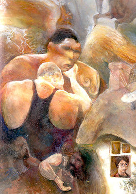
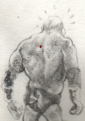
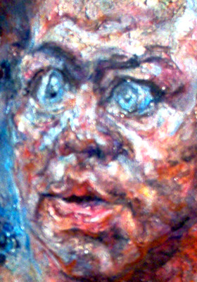
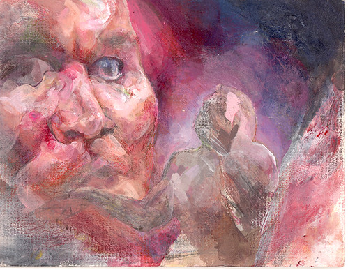
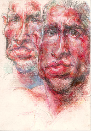
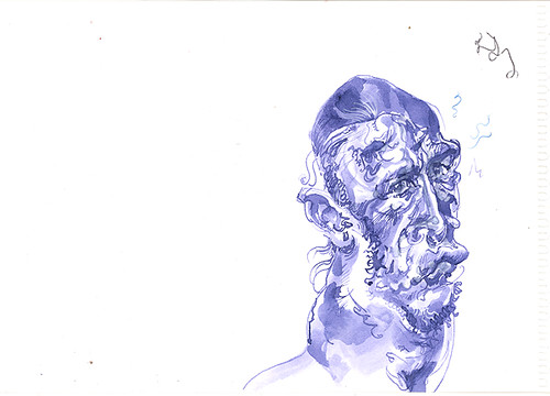
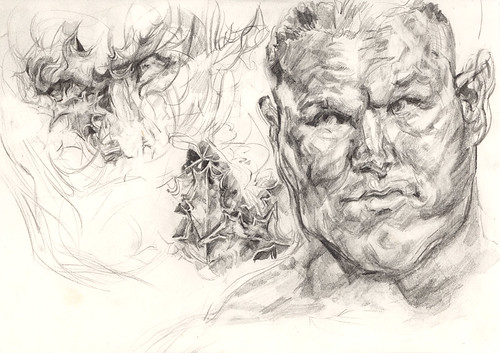
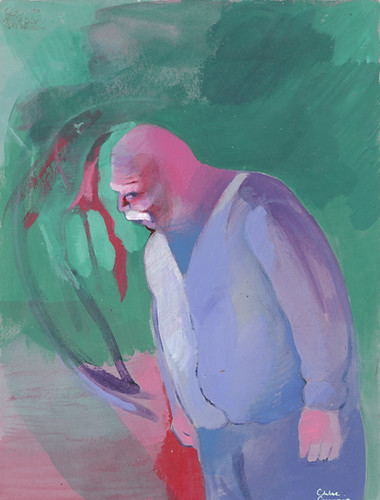
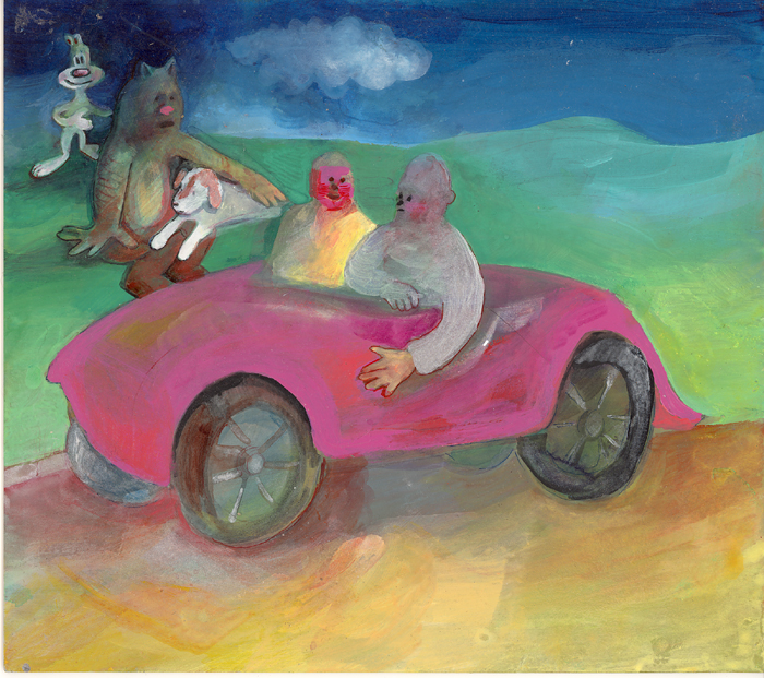
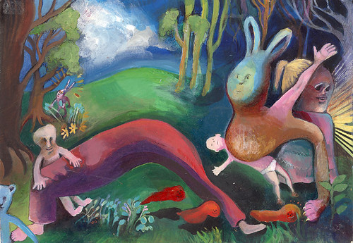
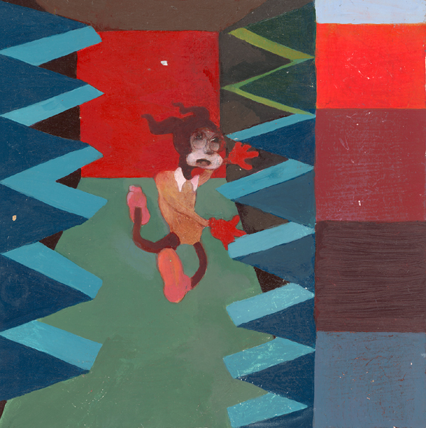
This will not be a usual kind of white blog for me. The pictures will not be new work. They will be a motley selection of stuff, which is exactly what will be at the show.


It is not big or long, it is for two days in an office space in Crewkerne.

It will coincide with the Crewkerne Jazz festival. Fancy some Jazz and Chloe? Why don’t you come along?

When I was younger my Dad used to take me to Crewkerne Furniture Emporium. It’s a big place full of old furniture. I remember they also had people’s old family photographs, that were unwanted or the owner had died. They were spooky and mesmerising.

I remember one that had written on the back ‘One of the last photos of Alan’.

Anyway, now I am trying to organise myself, which does not come naturally to me. I am also bracing myself for being physically near the paintings whilst people gawp at them and ask me questions. I am never prepared for the frequently asked questions; which is silly, seeing as they are frequently asked. What I’m doing, which is really an uphill struggle, is writing some wall text.


I hate wall text. At art galleries. Especially the contemporary kind.

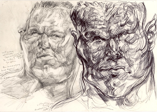
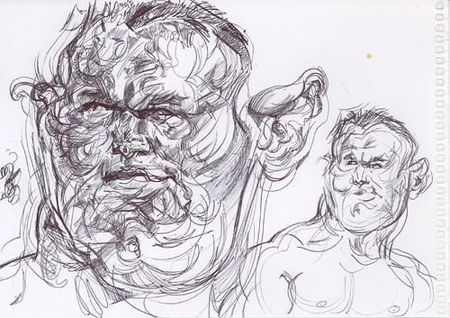
But I’m hoping it might go some way to diffusing questions such as ‘What’s this one about?’ and ‘Why wrestlers?’ and ‘Have you ever thought about illustrating children’s books?’.

But with the wall text, when I try to be concise, when I try to condense my meaning into pithy sentences… it comes out even more pretentious than the pretension I’m trying to avoid.

Here’s a quote from some stuff I have come up with in my wall text plan:

WALL TEXT ABOUT CHLOE

I don’t like wall text at art shows.

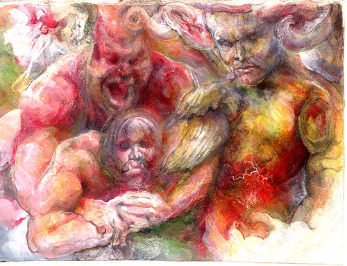
Whatever my paintings have to communicate is not verbal and cannot be explained in words. They are not about things. They are things.


See… that’s kind of meaningless drivel. It’s concise to the point of vague-ing itself to death. At the same time, maybe it gets the point across.


The point roughly being that I do not buy into the art school cliché where the paintings are about something and the thing they are about is something you have rehearsed talking about and it is something pseudo intellectual and you explain it to people so that they are in on it and feel they get it. All of which bypasses actual human responses to sensual stimuli and caters only to snobby ideas about being an Art Person, and Art being all about intellectual bollocks.

See this is why I like cartoon people and art shows make me want to run away.

I paint for real compulsive reasons, which have nothing in common with the mechanics of the art world. Nothing at all.


So… well I don’t want to make this blog all about writing. So I might update later in the week about how the preparations are going. Or about something else that’s fun, like George Herriman or stuff that doesn’t make me whiny.

But more importantly:

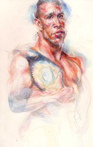
Kurt Angle has left the WWE, because his body and his brain and his soul were so battered he needed to stop before they all broke.


I love Kurt and his big eyes and his inimitable neckhead and his humour and his intensity. I loved painting him and I will paint him again, you mark my words.

Thursday, August 17, 2006

Dreamboats and portals


Time for some actual new bits.


That was one.

Not finished.


Well I told the wrestler Gregory Helms I was going to draw him. Then he seemed quite keen on the idea, so I thought… OK I’d better make it look a little bit like a MySpace profile picture.

But that might mean it needs to be a bit boring and flattering…

He proved tricky because he looks more like a real human being than the lumpen hypergrapplers I normally favour doodling.


I wanted to do like an otter with Gregory’s face to accessorise him, never quite got round to it…

Could make his likeness more weird and interesting if I found the energy…

Maybe I’ll work on it before sending any of this crap his way.

Here’s Gregory and his wooden brother, but which is which?


I’m not quite sure what to say about this next one….


But my favourite’s still the endlessly lovely Randy.

Now there’s a face with funlumps.

I took it upon myself the other week to begin the process of cross breeding him with some holly.

Here’s how we began:


I saw the potential for holly-derived lines in Randy’s facial contours. I picked some actual holly on my way back from the gym, and found the actual leaves were a right old pain in the bottom to draw… I dispensed temporarily with the actual leaves, but retained some of their prickly influence.


Randy moves his smug boyman face in an artfully loathsome fashion.

I love drawing him… his face seems like some kind of portal to way-outness.


Sigh… isn’t he dreamy?

Now… remember this old chestnut?


It’s still not finished. But I seem to be making a tradition out of posting its progress.


There’ll be more to say or more to see soon…

I want to return to one of the original stated purposes of this blog, and condense some of my big thoughts into digestible form here.

When I was talking to Marlo about blogs and blog performance anxiety, I theorised to her that it’s good to update regularly because it helps people to feel like they’re in touch with you (more relevant to her since she actually has fans)… but I need to take my own advice.

Cartoon people teach me lessons about eloquent & concise little lumps of communication…

So stay tuned while I redefine my purpose in front of your very eyes!

Thursday, August 10, 2006

Weird Retarded Old Paintings and What we may learn from them

None of my current drawings or paintings feel quite ready.

So I thought I might post some old weird paintings that I found whilst rooting around, piggy-style.

Even though I went to art school they didn’t teach me anything, so I consider myself pretty much self-taught. There are plusses and minuses to this situation.

Being self-taught has involved rather a lot of trial and error. Which includes quite a lot of error. But I’ve decided not to be ashamed of all this crap, because it’s all helped me to learn. In fact, it may still hold lessons for my present day persona.

Prepare for a parade of oddities.

I’ll see if I can arrange these in chronological order…

1. Glazey mouse hand


Now, that one was executed when I had just discovered glazing, and liquin. Liquin is a fluid resin medium with a nice smell about it. I was still obsessed with cartoon imagery but not knowing what to do with it. I sort of fetishised the trappings of cartoondom. Everything I did was a like a tiny experiment, because what the ‘finished product’ was meant to consist of was rather unclear. In this one I think the underpainting was in black and white acrylics, and the colour was built up gradually in liquin glazes.

2. Acrylic Melvyn Douglas


This was during a phase when I was obsessed with the idea of ‘iconicness’. And I liked Paul Newman, I think this image of old Melvyn Douglas is from Hud where he played Paul Newman’s father. He’s like a rigid plastic boulder here. But I’m just getting back into acrylics now and I see a lot of potential in their flat opaqueness, even if now I’ll be using it more in conjunction with more sophisticated mixed media techniques to bring things to life.


3. Idiot people in pink car


I think this was executed at around the time I started my degree course in 1999. I had leaving home on my mind. This was like a little private picture that was kept separate from my college nonsense. I don’t think I’d have considered it finished, then again, I wasn’t too certain what finish would entail back then. Some of these pictures are proper naïve, even though I could draw. I had lots of complex ideas about ‘expressiveness’ and how it relates to skill still to work through.

I still wouldn’t entirely ditch the idea that naivety has some virtue. Sometimes decisions about choosing ‘wrong’ lines or proportions are what makes a picture clever in its own particular way…or funny… but they ought to be well informed!

4. Geometrically peculiarly improvised landscape scene with loose limbs


Now this one was from a very strange phase in which I used to divide up the picture plane into elaborate geometrical configurations of triangles, then improvise the picture one triangle at a time. There’s always been part of me that’s drawn to methodical solutions and maths. I think it helped remove the pressure to settle on meaningful subjects.

I used to get so angry when people described my work as ‘illustrational’, usually because they meant in an art-snobby way, not because I don’t like illustration. But I was frustrated because I knew how serious I was about it, and because I knew how good I was potentially. But as long as I was at art school I found it hard to be motivated to complete anything spectacular, I was surrounded by so much irony and apathy.

5. Bimbo Potter and the not really smooth finish


Now the character in this is sort of a straight cross between Bimbo from the Fleischer Betty Boop cartoons, and Harry Potter. I can’t remember why, I was just mucking about. The scene is basically stolen from Bimbo’s Initiation. I guess the irony had got to me and I was experimenting with very flat ways to work with colour, and doing little test card squares was always fun and a little pointless acknowledgement of colour field painting or something.

There was a time when I veered towards a more smooth, shiny and meticulously designed kind of painting, a little bit like what Inka Essenhigh
has done, but then I found the Beach Boys and my soul came back into play.

I never meant the smooth characterless surfaces enough to do them properly.

But now it’s time to mix up soul and meticulousness. None of this is irrelevant, as material to learn from.

I will return with more drawings, new ones. I hope they'll be plenty alive and soulful once they're done.
Related Posts Plugin for WordPress, Blogger...