Showing posts with label dangerous colours. Show all posts

Wednesday, August 13, 2008

Light the New Old Ladder Moon

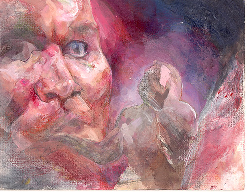
I finally finished this version of the Brian Wilson Moon/ Heaven Ladder painting that was started back in early 2004.

I posted some of my Beach Boys fan art on a Brian Wilson message forum, and I got this surprising response...

'What luck to see Chloe's fantastic Beach Boys-artwork online! I'm finishing an esoteric SMiLE-essay where Chloe's painting, the 5'th one from top (also known as "Light The Lamp" from its presentation in Open Sky # seven, 2004) will play an all important part.
Thanks Chloe and keep up the good work!'

I had no idea that my painting had taken on a 'folk name!' Or that people were writing essays about it.

That was in reference to the original version of this composition:


And here is the new one, finsished TODAY, a little bit more shuffly and snuffly, dusty and dirty. The composition is less graceful, with the sky jammed in. I blame my four years ago self for that. But it has its own thing.


Friday, June 27, 2008

joy of chalk

Now this is a bit more fun, if not actually less stupid.


I have some pastels now, but most of the colours are a bit full on. They are probably better in the long term in conjunction with more sobre media, but when you have something new, you gotta make a mess with it.

Wednesday, June 25, 2008

Jump About in Rainbows Birthdays

My computer is not broken any more!

It's good to update a blog, oh yes.

I might do a lot of little honest updates instead of big massive ones intended to wow you and distract from rubbish drawings with better ones. I'm going balls to the wall.

Here are my birthday drawings. I have started trying to draw David Mitchell, and also I got a lift home from a wedding on Sunday and some men looked at my drawings, and the men didn't say very much but I felt like my drawings were quite contained and monochrome, and I suddenly felt like I wanted them to jump about in rainbow pony colours. Even if the colours go through a bad phase, I need to make them jump about and just bite the bullet and do it.


I thought maybe I should do an art movement called Sunshine Lollipops and Rainbowsism.

Tuesday, July 17, 2007

Are these paintings finished?

Are these finished? Bear in mind, unfinished things look better on blogs than they do in real life.

I think this one is going to have to be finished, because it's so small and I don't want to drown its little mousey light.


This one would not be finished if it was left to me. But I painted it sort of with a commission in mind, and a different sensibility. You can see the brush strokes and that. The colour is chaotic.

The forms at the bottom are not clear or readable, which makes me uncomfortable. But my patron might like a bit of that.


This one is manic... I'm not sure quite where to go with him. The colours are dangerous on these. Less neutral than the last lot. He's a bit Vince McMahon, a bit pagan papier mache mask.


It's from when WWE were doing the 'Vince is crazy' bit just before the 'Vince explodes' bit, which they had to drop because of the real life Benoit tragedy. But Vince does have wonderful , wonderful facial expressions.


This next one is the left half of a painting that's been lying unfinished for a while. it's set in that graveyard I spoke of a few months ago. It has this big squish faced sleeping leopard thing swooping down draped in a tree.


Part of the thing is deciding whether the painting will be a fast fresh painting or a slow rembrandty crusty painting... not every way of painting is always compatible. And I'm not always good at decisions.


There there's this old thing, with Kurt who's now a bit bonkers himself. I always planned to do more to this, but now it doesn't seem necessary.


Which ones are finished? it's very hard to know all by myself.

Friday, December 15, 2006

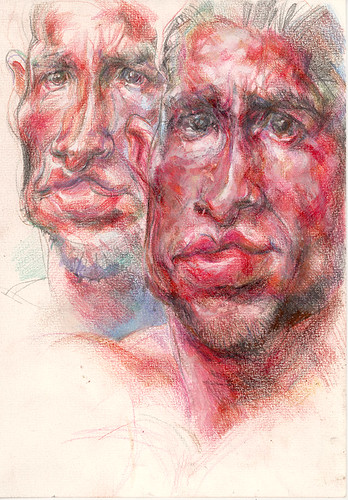
Composing Overlapping Chins

I'm sorry I haven't been especially erumpent lately, or that I haven't appeared to be. I think I felt that I didn't want to just pump out stuff to fill a blog, I wanted something a bit coherent, and I didn't want to get too repetitive.

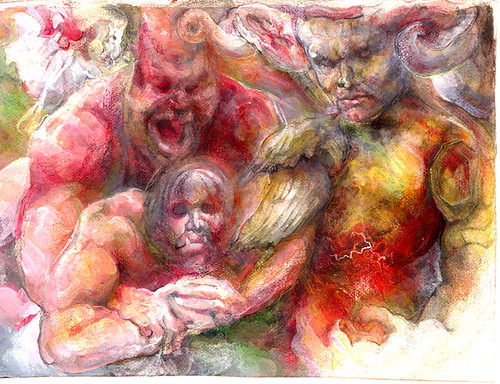
Having said that, here are some wrestlers and bats. This time in technicolour!


Oh manly boys, how they love to frolick in the undergrowth!

I am in a truly transitional period in that I'm evolving new ways to paint, quicker and fresher ways. That one was a bit of an awkward hybrid and a bit fussier and bittier than I want to be.

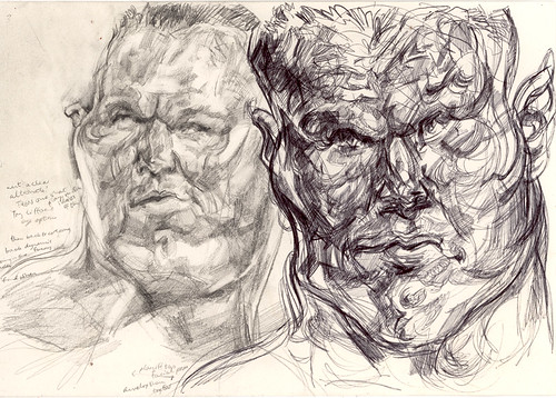
I'm working on a bigger version of that, which is becoming problematic, but I'm rying to give the colour in particular a new level of sensitive attention. Because I was having trouble with the John Cena in the big painting, (The one with the big head), I did some sketches today to try and make his design less stiff and symmetrical, more fluid and interesting.

he is stiff and graceless in real life, but it's my duty to find pretty ways of interpreting that. He's also childlike and inexplicably endearing, so those are the qualities I think I ought to channel.

In the first sketch I was only just waking up. You can almost taste the dullness of my brain in this one.


Then the head began to expand even further as a standalone object, dwarfing his ever more chubby cherubic boyman boyfriend. But it was getting more fluid.


Then I reintroduced some attention-seeking nipples to the scenario, for balance.


I never used to like drawing on bobbly paper, but I got quite into it today. I was using a 9B pencil too! Smudgy.

I have oil paintings, that are just not quite finished to my satisfaction, and there's not much point posting them until they are. But I can post little cropped details. You've seen these before in previous states of uncouth crudity.


Oh, and dear old Kurt.

My oil paintings take a long time, but I'm sneakily developing techniques that don't take as long, and that get to the point without dilly-dallying.


I keep feeling a strong urge to remake ALL of my old paintings in a bouncy happy dynamic cartoony style, chase away all pretension and confusion... which I'm sure is easier said than done. In real life I could probably only do that with some. But it's a stimulating thought.

I'm pretty sure I'm being directly influenced by John K and the purity of his vision for 'entertainment', and the purposefulness of entertainment. And increasingly I'm fatally turned off by the pretensions around all the things that call themselves fine art and the people who call themselves artists.

It may be time for me to learn new ways of drawing bunnies.

Did you spot the deliberate mistake? There weren't any bats! Ha ha!

More soon I promise!

Wednesday, October 25, 2006

Bat Mess

Now, when I start trying to plan big ambitious complicated paintings, the first drawings ain’t that pretty, because if they were, all perfect, there’d be no process or growth or point in doing anything to them.

The ‘ambitiousness’ needs time and space to grow.


That was a tiny drawing from my sketchbook. In tiny drawings in little pencil boxes on a sketchbook page, I can be quite nuts and stream of consciousness about things.

On reflection, I think a lot of the swirls and scribbles come from looking at good etchings (Rembrandt, Goya, Picasso) and wanting to get some meaningful expressive line-business in there amongst my paint. I want it all!

Wanting it all may be a crucial part of making my new work good.

There is to be a large threatening bat encroaching on a post 2012 world in which wrestling has been declared the supreme means of human cultural expression.

There’s more to the setting and backstory, probably, but I’m not no storyteller.


I’m going to get my boy wrestlers in there and make them be meaningful with their shiny sweaty faces.

I want to find the humour in my pigheaded seriousnesses and the seriousness amongst the silly pleasures in my life and in my hands.


Sketchbook pages get quite ugly when you’re trying to think about which acrylic colours to choose and which oil colours to put over the tops of them.

I should clarify, possibly, in the light of my last blog about those particular colours and John K’s recent blogs about colour, that I listed the actual tubes of paint I had picked out to use exclusively, rather than the neat colours I would be using on the picture. I mix them up. And I glaze and mingle them and it’s all very confusing, but I’m getting less confused. Whether I mix them up well or put them down nicely is not for me to say.


There are the mere rudiments of a painting. There’ll be progress on this soon, as I’m all obsessed with bats and inserting them in pictures.

Friday, October 20, 2006

the Era of Too Many Rich Reds

Well since I seem to have quite a lot of pictures to show you, I might do the paintings first, pace myself a bit.

There’s a palette I’ve used for a lot of paintings over the past year or so. I’ve been trying to finish them so I can finish up this era.

‘The passionate controversies of one era are viewed as sterile preoccupations by another, for knowledge alters what we seek as well as what we find.’ -
Freda Adler


Lately I’ve been finding these colours problematically bright and sweetie-like. There are too many of them. (Though this also presents an interesting challenge…) In the paintings I’m planning, the colours will be more ‘limited’, one way or another. At least limited enough that I feel in control of the colour and that it doesn’t dominate the other formal aspects of the picture. And so that it doesn’t look horrible and make me want to be sick.

Let’s be thorough about this. Here are the colours I’m lumbered with:


Michael Harding Phthalocyanine Blue and Zinc White


Grumbacher Pre-Tested Oil Quinacridone Red


Grumbacher Pre-Tested Oil Cadmium Barium Yellow Deep


(I think I made the yellow big because yellows are tricky bastards.)

Grumbacher Ultramarine Violet


Old Holland Flesh Ochre


Mussini Burnt Umber

mussini burnt umber

Later, when I came back to the palette and it all seemed a bit too warm and cosy, and I had just bought a MASSIVE tube of raw umber, I added that to the mix too.

It’s the size of the big tube here in front of the little tubes:


Only it’s this colour:


Wikipedia has this useful piece of info about Raw Umber:

Raw Umber is a color that resembles raw umber.


I have a brain that doesn’t like wastage. So when I have a great big tube of a colour, I mind less about using it liberally.

Some of the artist grade oil colours are very expensive, so I become quite… aware…of this when I use them.

The thing is, at the moment I’m veering more toward using acrylic and other waterbased media UNDERNEATH a final layer of oil glazes, rather than using oils alone.

This is because acrylic dries fast and flat, is pleasingly opaque and allows for a more dynamic ‘drawing’ process in which changes and adjustments can be made spontaneously. The combination of acrylic/ the other plethora (plethora!) of media compatible with acrylic/ and finally the richness of oil colour gives quite a lot of scope for intricate other-worldly finishes, and quite a lot of scope for the painting to develop a strong sense of purpose along the way.

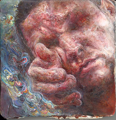
So this is Shelby, she’s a lady I painted with just oils, and taking advantage of the blobs and crags that inevitably appear. Using the above palette, I should add. I don’t think she’s finished.


Here’s her face in closeup so you can better see the texture. She’s painted on a ceramic tile:


in contrast, here’s a tiny painting from a while back painted in this palette but with a drawn/ mixed media underpainting and quite a lot more sensitive detail. Of course, it all depends on how much you like sensitive things….
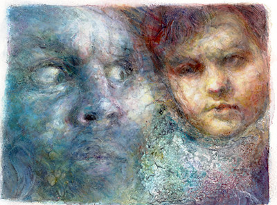


Now a peculiar half-breed… a painting that was getting on quite well being shiny and plasticky, but which has had a decisive opaque oil makeover in recent times. It’s another startled giraffe:


That’s all in the same palette. But I have been subduing it more, painting in flatter swathes with tertiary kind of mixtures, rather than being dictated to by the bossy primaries.


Now… this one’s got really weird. Bob said to me it’s funny that I should turn on a particular picture and call it weird when I’m always painting weird dog explosions and minotaur tantrums. But I’m finding this one tricky. It’s based on some of those old drawings, but it needs to evolve its own authority, it might need a radical change.

I think maybe it’s a transitional type of thing where I’m figuring out HOW I’m going to paint and using wilfully obscure combinations of subject matter and atmosphere.


And Kurt’s developed a bit of a tan.


Here’s another old one in the same palette. This one’s all in oils, but with the texture worked up to a fair old level of detail and teeny tiny brushstrokes and flourishes. There are lots of ways I like to paint, but I think this isn’t quite the way that’s right for Right Now.


I have more painted stuff to show, but I will save it for an imminent follow-up, since it’s all in different colours and generally it’s got a lot more to do with bats. Then there will be some drawings too.


Thursday, August 17, 2006

Dreamboats and portals


Time for some actual new bits.


That was one.

Not finished.


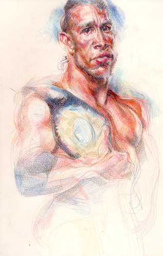
Well I told the wrestler Gregory Helms I was going to draw him. Then he seemed quite keen on the idea, so I thought… OK I’d better make it look a little bit like a MySpace profile picture.

But that might mean it needs to be a bit boring and flattering…

He proved tricky because he looks more like a real human being than the lumpen hypergrapplers I normally favour doodling.


I wanted to do like an otter with Gregory’s face to accessorise him, never quite got round to it…

Could make his likeness more weird and interesting if I found the energy…

Maybe I’ll work on it before sending any of this crap his way.

Here’s Gregory and his wooden brother, but which is which?


I’m not quite sure what to say about this next one….


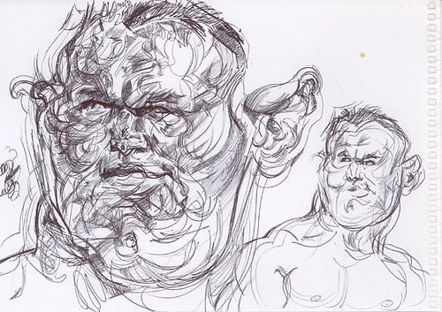
But my favourite’s still the endlessly lovely Randy.

Now there’s a face with funlumps.

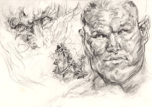
I took it upon myself the other week to begin the process of cross breeding him with some holly.

Here’s how we began:


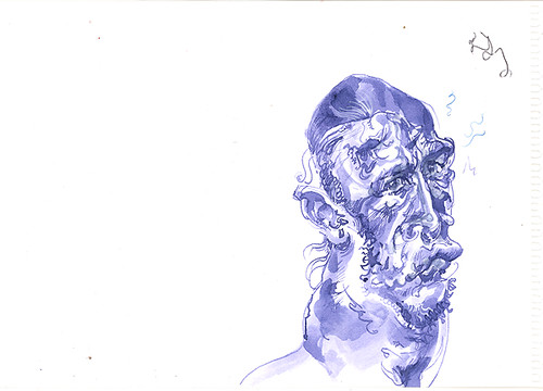
I saw the potential for holly-derived lines in Randy’s facial contours. I picked some actual holly on my way back from the gym, and found the actual leaves were a right old pain in the bottom to draw… I dispensed temporarily with the actual leaves, but retained some of their prickly influence.


Randy moves his smug boyman face in an artfully loathsome fashion.

I love drawing him… his face seems like some kind of portal to way-outness.


Sigh… isn’t he dreamy?

Now… remember this old chestnut?


It’s still not finished. But I seem to be making a tradition out of posting its progress.


There’ll be more to say or more to see soon…

I want to return to one of the original stated purposes of this blog, and condense some of my big thoughts into digestible form here.

When I was talking to Marlo about blogs and blog performance anxiety, I theorised to her that it’s good to update regularly because it helps people to feel like they’re in touch with you (more relevant to her since she actually has fans)… but I need to take my own advice.

Cartoon people teach me lessons about eloquent & concise little lumps of communication…

So stay tuned while I redefine my purpose in front of your very eyes!
Related Posts Plugin for WordPress, Blogger...