Well since I seem to have quite a lot of pictures to show you, I might do the paintings first, pace myself a bit.
There’s a palette I’ve used for a lot of paintings over the past year or so. I’ve been trying to finish them so I can finish up this era.
‘The passionate controversies of one era are viewed as sterile preoccupations by another, for knowledge alters what we seek as well as what we find.’ -
Freda Adler
Lately I’ve been finding these colours problematically bright and sweetie-like. There are too many of them. (Though this also presents an interesting challenge…) In the paintings I’m planning, the colours will be more ‘limited’, one way or another. At least limited enough that I feel in control of the colour and that it doesn’t dominate the other formal aspects of the picture. And so that it doesn’t look horrible and make me want to be sick.
Let’s be thorough about this. Here are the colours I’m lumbered with:
Michael Harding Phthalocyanine Blue and Zinc White

Grumbacher Pre-Tested Oil Quinacridone Red

Grumbacher Pre-Tested Oil Cadmium Barium Yellow Deep

(I think I made the yellow big because yellows are tricky bastards.)
Grumbacher Ultramarine Violet

Old Holland Flesh Ochre

Mussini Burnt Umber

Later, when I came back to the palette and it all seemed a bit too warm and cosy, and I had just bought a MASSIVE tube of raw umber, I added that to the mix too.
It’s the size of the big tube here in front of the little tubes:

Only it’s this colour:

Wikipedia has this useful piece of info about Raw Umber:
Raw Umber is a color that resembles raw umber.
I have a brain that doesn’t like wastage. So when I have a great big tube of a colour, I mind less about using it liberally.
Some of the artist grade oil colours are very expensive, so I become quite… aware…of this when I use them.
The thing is, at the moment I’m veering more toward using acrylic and other waterbased media UNDERNEATH a final layer of oil glazes, rather than using oils alone.
This is because acrylic dries fast and flat, is pleasingly opaque and allows for a more dynamic ‘drawing’ process in which changes and adjustments can be made spontaneously. The combination of acrylic/ the other plethora (plethora!) of media compatible with acrylic/ and finally the richness of oil colour gives quite a lot of scope for intricate other-worldly finishes, and quite a lot of scope for the painting to develop a strong sense of purpose along the way.
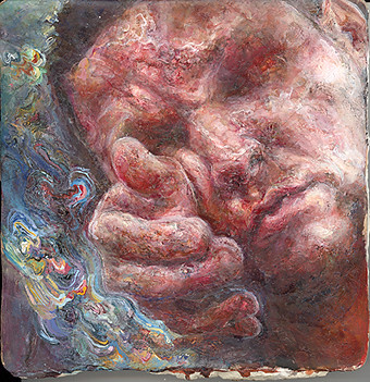
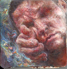
So this is Shelby, she’s a lady I painted with just oils, and taking advantage of the blobs and crags that inevitably appear. Using the above palette, I should add. I don’t think she’s finished.

Here’s her face in closeup so you can better see the texture. She’s painted on a ceramic tile:

in contrast, here’s a tiny painting from a while back painted in this palette but with a drawn/ mixed media underpainting and quite a lot more sensitive detail. Of course, it all depends on how much you like sensitive things….
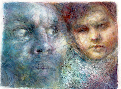
Now a peculiar half-breed… a painting that was getting on quite well being shiny and plasticky, but which has had a decisive opaque oil makeover in recent times. It’s another startled giraffe:


That’s all in the same palette. But I have been subduing it more, painting in flatter swathes with tertiary kind of mixtures, rather than being dictated to by the bossy primaries.

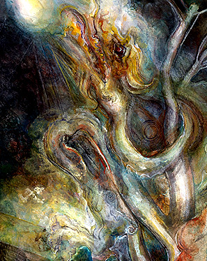
Now… this one’s got really weird. Bob said to me it’s funny that I should turn on a particular picture and call it weird when I’m always painting weird dog explosions and minotaur tantrums. But I’m finding this one tricky. It’s based on some of those old drawings, but it needs to evolve its own authority, it might need a radical change.
I think maybe it’s a transitional type of thing where I’m figuring out HOW I’m going to paint and using wilfully obscure combinations of subject matter and atmosphere.

And Kurt’s developed a bit of a tan.

Here’s another old one in the same palette. This one’s all in oils, but with the texture worked up to a fair old level of detail and teeny tiny brushstrokes and flourishes. There are lots of ways I like to paint, but I think this isn’t quite the way that’s right for Right Now.
I have more painted stuff to show, but I will save it for an imminent follow-up, since it’s all in different colours and generally it’s got a lot more to do with bats. Then there will be some drawings too.