Showing posts with label common sense. Show all posts

Sunday, September 07, 2008

organic hip potato Chloe

A bit more like it... I kind of relaxed with Chloe and improvised jazzwise with her. It is good to be organic with things.


The photos these were from were in full sunlight, which makes for squinting and strong dark shadows, obviously.


Friday, June 06, 2008

Going back to boring

Here are some drawings that have been done for a while but that didn't make the blog because of being the first stage, the conservative drawing, the boring drawing, not fun enough, etc. Just studies. Just doodles. Just learning. No particular place to go. Unfocused. Likenesses only loosely grasped.

But I was looking at some of them and thinking, they're not so bad.


Besides, I'm thinking in terms of getting more subtle, rather than getting more wild and crazy. Retracting my claws. Retreating to a state of measured moderate centredness in order to find the truth that way.


I quite like Beatrix Potter at the moment. And her scientific naturalism and love of fungus.


This next one's a mess. But sometimes, mess is what one makes.


Gosh, aren't I chaotic. It won't do. Still there's just so much nice stuff to look at in the world. It's not easy to decide.


Here is one of my last wrestler studies. Randy's uglier inner qualities are seeping out increasingly.


I've actually cancelled my Sky Sports subscription and am on a break from watching wrestling. I have broken up with it. Still, I have plenty of material still if my ambivalence lets up.

Here's when I suspended my judgments and tried to look anew at these two faces. I had been overly mean to John and overly kind to the other one, possibly. There are lots of aspects to a face. It's almost like they're alive.


Here's Katie the moon scientist before she was pink.


'Hair not pretty' I wrote.


Here's Bob having fun in zero gravity and having no boundaries.


Note the Rex rabbit 'studies' in this one.


Meditations on a waxed sex monster. These drawings often threatened to become something obscene and riddled with rudeness. But I never quite went there. That would be... a niche.


So I shall make a nicer taste by leaving the last word to Jeremy Fisher. In this picture I identify with Jeremy. Jeremy is me, or perhaps you, and the stickleback represents all the scary things in life.


NB. sorry if any of these have actually been blogged before. It's hard to remember everything. They're all familiar to me, but I hope it's from real life and not from prior blogging.

Sunday, February 17, 2008

Pick of the Pops

My deviantart top 5

Deviantart has a feature where if you 'browse' a gallery and then arrange the items by popularity, I can get a sort of a hit parade of my most popular images according to how many views and favourites and comments they've got. I'm sorta fascinated by which of my pictures end up where in popularity. I never quite would have predicted they would end up in the order they're in. Maybe the Deviantart crowd are a very specific demographic.

Here's the chart rundown from 5 to 1. (Click on the images to get the the corresponding deviantart page including comments.)

5. Gypsy Chaos Goat


-I put up this one and the other goat, and I really always thought the other one 'Softie Goat' was better. But this has only been up for a week and it's already top 5. Maybe it's more rough and rugged than the other one. Or has a more sexy title. It has computer game mage hijinks or something appealing the the WoW addicts of the world.

4.Three Teenage Moons


- I kind of understand why this is top 5. It has detail and it's all emotional and soft and warm.

3. Empathetic Minotaur


- This old chestnut... this is always popular on the internet. The original was tiny. I must have hit on something good with chaotic mix of delicate little mediums. The original was tiny. But the internet isn't fully cognizant of that.

2. Kids in the Forest


- I would not have expected this to be number 2. It must be the cuteness of the theme or the multiracial niceness or something. It's all vague, like some of my stuff of that era was, and quite primitive in its shapes. It was from an obscure movie photo or lobby card or something.

1. (By some distance): Orton Flair Three


- And it's funny because it's not mainly wrestling fans who like it. It's people who don't know who they are. But comments say things like 'moving' . I can't quite put myself in their shoes and see what they see. It is the third version of this image I did, and it's the closest of all my images to straight 'fan art'. I never really thought of it as part of the main flow of my oeuvre. No way! I think in the end a hardwired conservative part of people likes convincing heads and likenesses, but also pretty people and simple things.

The whole of the top twenty on Deviantart are all paintings. You have to go to 21 to get the first drawing. People like colour. It's more real to them or something. My favourite way out drawings tend to be less popular. Or maybe people just don't know what to say about them. Maybe they're less comfortable and more radical in a good way.

Tuesday, February 05, 2008

Bob's Dental Polygons

I had done some very quick sketches of Bob for my portrait, then i took the idiosyncrasies of the quick sketches and made some Round Bobs. His face is hexagonal or something. I always reckoned Bob's dad has octagonal eyes. These men are constructed of many sided regular polygons.


I drew Bob from life while he was watching Mythbusters or some old man programme. No! Actually it was a repeat of Small Talk with Ronnie Corbett.


Here's Bob being willowy with a more protuberent schnozz.


Bob likes colour coordinating his bike shoes with his bikes. (A cat trod on this one with its mud paws of doom.)


Monday, January 15, 2007

Uglycute Satsumahead Gift Explosion!

This is a post for numerous fragmentary drawings which are probably leading up to something. I think I need to lose my ambivalence and my doubts about frequently drawing wrestlers and commit to making something beautiful and complete out of it. And transcend petty issues like the mere choice of subject-matter!

But in the meantime, I have been attempting to fathom out various aspects of design and likeness and colour and generally trying to focus my intent by just drawing and seeing what grows.


(words about that last image:)

It's easy to concentrate a lot of energy into a page of tiny thumbnail sketches like this, when all is excitement and potential. It's harder to transfer that kind of energy into something more complete, complex and decisive.

We're going back and forth in time a bit now. When I started looking at the Orton/Edge pairing, I did this study in coloured pencils.

Then added a bit of gouache when I got frustrated.


And I remembered that coloured pencils tend to be better when I already have something resembling a design and then I can play with it, using the pencil marks in combination with the white of the paper. In this finding-my-feet drawing, just doing swathes of colour with no gaps, they were annoying. They aren't a good replacement for paints on jobs like this. They felt kind of girly and weak. They're more like a kind of delicate hybrid between a drawing and a painting implement, and I think this might be a good way of thinking about them in future. But still, it's just a sketch. I think I'm writing all this about coloured pencils because actually I like them and I want to get more out of them. Also I have a really nice set of 120 Faber-Castell ones.

I commited my self to drawing this man who calls himself Edge. Because he's a wrestler and therefore somewhat culturally... self-contained, he doesn't have to worry about getting mixed up with the guitarist out of U2.
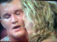


The chin is key, obviously. He's not a person I was immediately excited about drawing, but that's the challenge, to try and make something fun out of it anyway. He did actually once have the Loveliest Hair in wrestling, all golden and wavy and soft and well conditioned and flowing. Now it's a bit stringy.


Edge WWE

Edge WWE toy

Now we're moving backwards in time to when the Christmas colours one wasn't finished. In fact, I'm not sure I'm entirely happy with the way I did end up colouring it in. I'm still settling into a new approach.

I think I gave Randy child-bearing lady-hips a little bit in an effort to squeeze in his enormous thighs, which are so important to his general silhouette and which I have too often heinously neglected.


Actually, one of the challenges with drawing wrestlers generally, and especially when I'm tending increasingly toward the cute or the cartoony, is fitting the enormous bodies in whilst not reducing the heads to the size of satsumas. I think with skinny people or girls it's easier and natural to distort the heads and make them proportionally big, but if you did that with wrestlers you might sort of miss the whole point. There's that, and also the fact that even if I'm 'tending towards the cute' a little more these days, I still want there to be something real-feeling or even classical about these bodies.

satsuma tangerine

(A satsuma there, of the kind to which I was referring.)

Here's one of those sketchbook pages with old words and newer pictures.

I think it's got some quotes from Delacroix's journals.

Also me reminding myself to 'learn clouds'. Whatever that might mean.


For Christmas I got some new colours. I was staying in a small house with my family. I squoze out this masterpiece:


Well, it's nice to get in touch with one's new colours anyway.

I've been thinking about watercolours but I haven't got beyond some very rough primitive sketches because I just haven't put together all my intentions yet. But sometimes it's OK to make a bit of a mess if it helps me visually and tacitly to sharpen my awareness of how I should organize things.


Here's a little bumpy paper oddity:


Poor Randy, I'm sure I do still think he's beautiful, but frequently these days he becomes a demon turnip. I've been trying to strike a balance between ugly and cute or even ugly and beautiful, and these might be straying further into the ugly dimension than I want to be. But again, it all helps me to clarify what I do want to achieve.

And the other thing is, ugly-looking faces and ugly design do not necessarily go together. I could make a beautiful design out of an ugly face. Or even a beautiful design out of a beautiful face uglified!


I'm reading a book called The Gift: How the Creative Spirit Transforms the World and even though its concerns are a little bit abstract and ethical to apply to the common sense/clarifying aspirations of this blog entry, it's made me remember in quite an immediate way that often the best way to make a painting good is to imagine giving it, or to actually intend giving it, as a gift to someone you care about or respect. It gives a kind of focus, removes the vulgar capitalism for a moment, and lets me just focus on the idea of making the gift-picture as good and honest and concentratedly beautiful as I possibly can.

tags: , , , , , , , , , , , , ,
Related Posts Plugin for WordPress, Blogger...