I’ve started painting a dragon in a tree for a kind of sort of illustration commission.
It’s barely started really. I want to get it good and luminous and spooky by the end.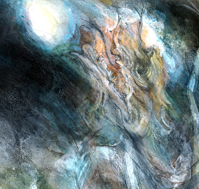
I’m using a lot of different media to get fast rich-surfaced results. It’s all a little bit mysterious and I’m figuring it out as I go along.
Different brands of hot pressed watercolour paper are like potatoes. They vary from waxy to floury. The waxy papers are better for pure watercolour painting, because it’s easier to lift colour from them and they don’t take pencil very well because they don’t have much of a grain. Floury papers are good for mixed media because they do take pencil marks and almost anything you can throw at them really. I think that Fabriano hot pressed paper is quite waxy. The one I’m using now is floury and I can’t remember the brand… Saunders Waterford! That’s it.
I’ve realised that with boring old non-cartoon long winded painting type art it’s less easy to squirt entertainingly bloggable eye entertainment out of it on a regular basis.
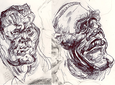
But it happens I’ve also drawn Randy and John again for sheer man-face-contrast boisterous biro fun. If only I had no other obligations I could spend all my days in such joyous manboy scribblings. I want to take it to weird far out places.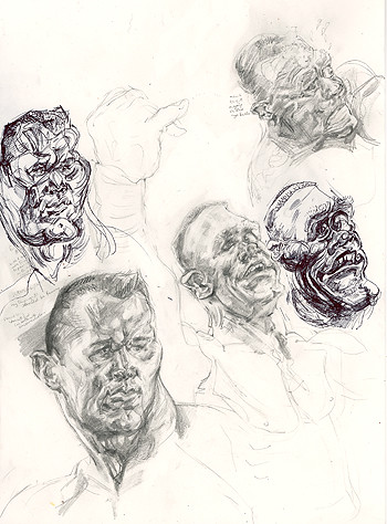
In a sense it’s perverse for me to draw wrestlers when they are peculiar twilight scorned quasi-celebrities, and perhaps if I painted real celebrities such as Lindsay Lohan I would be more accessible or something.
But I love doing wrestler faces. I love the man shapes. I love the pantomime expressions. I love the mime and the bodily expressiveness. I love doing these two in particular at the moment and I don’t want to lose my thread.
Doing a pair of faces lets them bounce off each other. It makes you more sensitised to their striking differences. I tend to do Randy’s eyes particularly tiny and beady and shifty in these whereas John’s eyeballs quite frankly have trouble staying in his head. Randy is extremely sinuous, supple and graceful whereas John is a graceless but endearing ogre nonchalantly whittled by the god of plasticene, whose name is Mr. Wobblyhands.
I love alternating between pencil and bic biro. I observe differently with each. I see differently. I love the fun and irreverence of a biro. Biros are sexy. It costs twenty seven pence or something and it’s practically my all time favourite drawing implement.
My REAL hardcore work is big epic oil paintings that are either nearly finished or yet to be conceived. I’d be doing that if I could really choose. But I gotta stick with this children book cover business for now and try to make it brill.
I feel I’m getting in a groove with these things so I hope to get some more regular white blog action happening.


4 comments:
I don't give a damn about wrestlers, but your drawings of them are cool because they're so ugly. Why is it that ugliness seems to gave more variations than beauty?
I like the dragon a lot. If I'm interpreting the pic right, that is. Is he looking up and left? I wish I knew how you get that messy texture that covers your paintings, they seem so ethereal (the ones in this style).
Hi Gabriel, I do appreciate your being a regular visitor here.
Hmmm…
I’m not sure I was going for ugliness exactly…
There’s a lot to this issue of ugliness and beauty actually.
OK, in terms of wrestling in general, I recognise that there’s a certain quotient of grotesquery in it, in the inflated bodies and sweat and grimacing and all that. That’s partly what attracts me to drawing/painting it. I always wanted a ‘masculine influence’ to balance out my feminine natural state. But I also always wanted to take all that man sweat and make stunningly beautiful, nuanced and delicate paintings out of it. That was the challenge I set myself ages ago.
But then, these drawings aren’t really a part of that challenge, they’re a side ‘project’, they are primarily for my own entertainment. But that’s not to say that entertainment is a shallow thing to aim for. Figuring out what entertains you actually can get quite complicated.
Whatever human being I draw and however much contempt, love, disgust, indifference or whatever I feel towards them, I never want the tone of my drawings to be contemptuous. I try to make them honest though, honest to the things I find funny and the things that I see.
But I also recognise that in pure physical terms lumpy man features when depicted with attention to detail and a lot of biro lines can have a certain ‘ugliness’ about them. But then, I’m a heterosexual woman and I like men and their sweat. I think a lot of the associations with the word ‘beauty’ come from a predominantly heterosexual male perspective where beauty’s all about softness and idealised femininity.
The dragon… it’s really hard to describe the technique and the layering involved because I am sort of making it up as I go along. I might have been better off planning it more meticulously, but I do sort of have a second version on the go too, so I have space to try out contrasting approaches. It’s that two things bouncing off each other thing again, working in pairs can give a clearer picture of what you want from both and it strengthens their individual identities.
I love the Randy Orton and John Cena drawings ... have to admit I have a real thing for your biro sketches.
image source gucci replica handbags find out this here gucci dolabuy find out this here replica bags china
Post a Comment