Wednesday, July 26, 2006

Giant insects invade

Right I’m going away for a couple of days, to a place of pigs, tents and leeks.

I have elucidated this fact on my MySpace blog and my grey blog. Go to those places if it seems slow here ever, something will be happening somewhere.

I’m actually doing some drawings involving attempting to incorporate the shapes of holly leaves into faces, but they feel like a little set that’s not quite ready to see, so for now I have just these:


Photobucket - Video and Image Hosting


Old half finished paintings of minotaurs. When I looked back at them having experienced my drawing renaissance, I realised that they seemed to be all paint and no architecture. They were drowning in their own paint. So I’m kind of re engineering the whole thing with the old masters in mind, starting with white lines, progressing logically into establishing dominant forms etc.


Photobucket - Video and Image Hosting


And how about this. We had an insect visitor, I cannot express how massive she was.

My dad is an entomologist, so I rang him up and tried to express to him how MASSIVE the beast was, all excited, but he was playing it cool, unfazed by this talk of massiveness, being familiar with these creatures like an old pro. But I could tell he was secretly pleased with my ringing him up to talk about insects. It was a female great green bush cricket.

My dad, being a caution-happy scaremonger, also informed me that they do bite and can draw blood.


Photobucket - Video and Image Hosting


She was standing on top of the fabric dog that sits atop the television set.

Will be back with astonishing frequency in future weeks to let you know about my collapsed little micro-world of bath-wrinkled vision.

Monday, July 17, 2006

Nipper Eyes

I’m sorry it’s been so long since the last update. I have been painting with a view to getting some things finished. Painting is time consuming.


I’ve thought about posting stuff that isn’t my work, but then I thought that might get confusing and I like the purity of this blog.


I’ll give you some boring updates on things I had already started last time first.


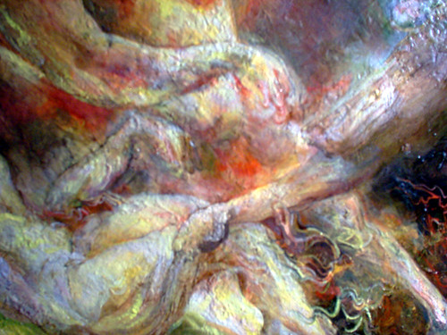
Like I’ve been working on this monster painting with lots of red and green and yellow. I remember thinking when I chose the palette that I wanted the red and green to rub up together in an optically awkward way. There’s too much yellow in it at the moment, I plan to make it more cloudy and moody. Then when I’ve finished it I’m going to do something I’m more in the moment and passionate about. This is a strange exercise in problem solving at the moment, but it is improving as I persevere.


Then there was that pink ink one which I’ve ruined by putting other stuff on top. But it will get better before it’s finished.


And the one with the wrestling and the orc and the by now familiar cat man… This one will look a lot different by the end too. This is more sandy. The other one was more wiggly. It’s got everything and the kitchen sink in this one.


Then the bat one, that has grown. It’s acquired some colour and some new pecs. This is part of my perverse wrestling imagery Chloe revolution reaching beyond the comfort based tyrannically cool school of imagery choosing and reaching toward the transcendent power of enriched vision beyond culture. And it has a bat.


I wanted to get to grips with the somewhat fascinating graceless rectangularity of John Cena, as those of you who vaguely follow the incoherent babblings of my grey blog may know. So I started drawing him, I started the big one in the bottom right corner wanting it to be purely done with coloured pencil since I hadn’t tried that for a while. But I felt I copped out when used watercolour and ink too. Also it looked too conventional or professional or something, not very interesting. Because he already looks like a cartoon or an action figure, there’s nothing clever about this drawing really. If there are elements of him which are unedifying, I wanted to try and make my drawings in some sense edifying despite the odds.


So what I did was I redid that entire page almost purely in coloured pencil, to see if I could take it to somewhere more interesting and uncover my purpose a little bit more.


In the top centre one, in his eyes I made him look a bit like me age three and apprehensive about being photographed. My motherly instincts and compassion seeped out, I couldn’t make him entirely hideous.

And working in coloured pencil took me back to age thirteen when they were my main medium. The memories were surprisingly potent. That was an age when I significantly started developing my own ‘techniques’, which had been a private milestone, I realised. I’m quite soft and gentle with them, which is interesting as a counterpoint to all the other media I’m using in less puritanical ways. I’m re-educating my seeing at the moment.

Friday, June 30, 2006

Bat Flash Jesus Ghosts

Well, I said summer blockbuster. Sometimes I think I promise too much, just for the sake of suspense. Do I think I’m Hitchcock? What a fool am I.


I went back to a big old painting.


The painting originally was going to have Janus and Paul Gascgoine (ex England football player famous for crying at the 1990 world cup) and a barn owl and Shirley Temple and Jesus and Andre the Giant. It was quite a scene. I thought I’d sort it out compositionally with my immense virtuosity. I was thinking wishfully.

I’ve done some fresh little studies in order to commit myself to this gazza janus temple project.

Here’s a little pink ink one. It’s alright but the subject is too weird for such lightness of touch, or that’s what I thought when I was looking at it. I want to experiment with layering stuff over the pink. When I planned these dense weird subjects, I always meant for some of the ‘resolution’ to come through the process of painting itself, as pretentious as that might sound.


Here’s the whole monstrous thing as it stands now. I think it’s salvageable. I’m getting good and impatient with it, like Delacroix.


The next one is a more involved study that will become something more like a painting in its own right. Quite drawing-heavy, and incorporating Randy biting Kurt’s arm but simultaneously possessed by an Orc.


Here’s a detail from the big one, a bad photo taken with flash. I put it in because I saw a little face in the bumps on the reflection then drew the little face on photoshop. It makes me remember how excited I can get about the potential of oil painting. I could illusion myself up some shine and have a whole alternative layer of shine universe on the surface, if I was committed to the idea.


Next here’s Randy and John with a friendly bat. This is unfinished of course. I’m trying to grow the fun of my wrestling drawings and not suppress these urges but make them beautiful.


Funnily enough I sent John Cena a myspace message today. He seems a good sort, but I hope he’s not upset by my depictions of him. They don’t tend to be especially pretty.

Next here’s a fragment of yet another version of the Janus monster painting, but bigger and rougher. One of the faces of the two faced god is Shirley Temple. Some of the scribbling and lumpyness felt meaningful at the time.


Lastly here’s some minor self portraiture, in which my eyebrows go on their own merry way. I was hoping to come up with something cute enough for a new avatar, but I’m not sure.


I want to get back into drawing with my isograph pens. But they are a real hassle. I realised today that I wasn’t the only one who experiences this because I read an interview with R Crumb in which he talked about his rapidograph pens (nearly the same thing) and how you have to endlessly coax them and shake them and take them apart and get ink all over yourself and wash them and stroke them and sing to them in lilting tones. But they do make a darned nice line, they handle in a way I like. As much as I love biros, bless their 27 pence socks.

I’m thinking a lot about Hogarth and Gillray and Cruikshank and the history of funny English draftsmanship.

Friday, June 23, 2006

Pink Sugary Inky Mouth Holes

I think I’ll sandwich some dodgy digiphotos of unfinished paintings between some nice new drawings. So here we go.

Here are some attempts at self-portraiture, done in pencil and I am occasionally getting impatient with pencils. But I still feel that I need to satisfy my meticulous urges and I learn from being all pernickety about the pencil drawings.

I was trying to illustrate the lopsidedness of my face. The right side of my face has shrivelled bones. Instead of a jaw joint it has a piece of my rib. It’s a long story.


Now here are some of the paintings in which I have used the ‘X Factor’ palette that I mentioned last time in the comments.

The thing is my digital camera is very cheap and the colours come out crude.


It’s hard to tell from that, but I have worked on this one. Oil paintings like this tend to go through distinct phases. There’s a phase when they’re new and fresh and they look all flushed with the glow of youth and potential and many an art teacher would shout ‘leave it alone’.


But I’m interested in potential so much as I am in trying to make perfect paintings. So often I want a more dense and finished finish, though not necessarily a smooth and polished one, so there are always tensions to resolve. But between the flush of youth stage and the point of ‘perfect finish’ there tends to be an awkward adolescent stage where it’s neither finished nor fresh and just looks a bit ungainly. That’s the stage Kurt’s neckhead’s at, not that you’d be able to tell from that picture.

It takes some concentration to keep the thing alive even with skin-disease-like levels of detail.

Click on the next little square to see Shelby, the unfinished internet pinup lady. She is holding her breasts.


Here’s some kind of sentimental angel:


This next (older) one might be my favourite of my uses of that palette. It’s different though, it’s oil glazes over layers of other media, in miniature:


Now here’s a fairly unedifying sketchbook page in which you can see my brain at work, also I was thinking through next oil palette options.

(You have to click on the tiny square to see the whole thing)


Now how could I let an entry pass without some great big sweaty wrestler faces.

This time Randy became an eggtomato, and as for Kurt, I think that because I felt so guilty for making him into Slimer I went overboard and made the most megacutesy sugar overload babyfaced kurts in the universe.

It did make me want to draw more in pink ink though. Like splatter it all over the place.


The pink Kurt looks like a fountain, he looks like water ought to start spurting out of his mouth hole.

Next time I might have begun to tackle my epicness epic painting desires. It’s time for something more like a summer blockbuster.

Wednesday, June 14, 2006

Everybody loves me! I'm freakin' adorable

This week I have been intent on capturing the wrestlery thumb-like pink cuteness of Kurt Angle the wrestler.... with varying degrees of success. (The title of this post is something he once said.) I think I’m building to something. I like doing at least two people on a page. Peoples’ faces are so gorgeous and so ridiculous. It’s nice to have two in order to milk the comedic and miscellaneous chemistry that occurs between a pair of mushes.

I’m also still a beginner at this caricature business, and I haven’t quite figured out what I ultimately want from it, apart from the obvious cheap thrills. Now let’s see….


The above page was my breakthrough page. I think a key factor is the regrowth of Kurt’s eyebrows (in real life) after several months of overzealous silly plucking. They add a lot to the expressiveness of his face, and it was his distinct expressions that helped my Kurtify my Kurts in this instance.

The big one on the top left ended up looking more than somewhat like Slimer from the Real Ghostbusters. I regret this a bit because Kurt is cute. But he does have a big rounded intense manface.

The demonic gargoyle biro one in the middle at the bottom looks nothing like him really, but I liked the way the process was taking on its own momentum and getting towards some way out places.


Then I noticed that the problem is a cartoony Kurt gets a little bit Disney. Like a cute Disney goblin sidekick. That didn’t interest me.


Nope, still in loveable babyman territory…

I felt I almost had to go wilfully nuts at this point, or try to see him anew. To get a bit bad at drawing or a bit very good. I got a little somewhere.


I wanted to try to get across some of the startling bigness of his eyes without them getting too… obvious.

It helps to include the bod.


Kurt’s big pink wide eyed neckhead has even found its way into pre-existing oil paintings. He looks like he’s just fallen in love! (This isn’t finished.)


Next time: Stuff that’s not Kurt!

Here’s a bit of a preview of something else. It’s a very poor blurry photograph of a hermaphrodite Ric Flair Britney Janus Wind God detail from a nearly finished epic landscape painting.


I love all your comments and interest and stuff.

Friday, June 09, 2006

Spooky goat man variations and cartoonlessness

Here’s a little watercolour study of Kurt Angle done in the spirit of Turner. This one is FINISHED, I think. It’s teeny tiny.


But it turns out he’s really hard to draw. Here are some frustrated little studies. I will understand the shape of your head Kurt, one day.


Now here are a couple that have been nearly finished for a long time. (See my current grey blog entry for more on my nervous twitchy issues around finishing stuff.) These are still not finished, but on a screen that has less meaning. One is a softer more diffuse supernatural Randy Orton goat man (he needs more electricity though).


You might have noticed that I draw Randy Orton a lot. This would be difficult to deny.

One’s a slightly more rugged fluorescent Randy Orton goat man. I used a lot of white lines on him.

I was trying to incorporate some zeitgeisty graphical lighting inflections from game screenshots. Spell effects from RPGs and things. It seemed a wholesome way to attempt to be zeitgeisty.


Those are the at the spookier end of my idiom I reckon. Very dense and peculiar layering of materials going on here.

It’s nice to do two of something. It allows you to explore subtly divergent variations on an atmosphere.

I’ve got nothing very cartoony this week. It’s a shame. It’s one of the most challenging things to do well. Soon though. Soon it will come together.

Wednesday, May 31, 2006

Escher Cheekbones and Heinous Seepage

I’ve kind of finished the infernal dragon. That’s that out the way.

(Click on any of today’s image for a larger version on Flickr. And you could even leave a comment there if you like. But if push comes to shove, I prefer comments here on blogger.)


In the last stages of this mixed media monstrosity, I used a lot of white lines with a thin brush and this stuff called liquid paper. I wrote a little note that said ‘white lines connected to my mind’. I could feel this an exciting little development that I will carry forward to the pictures wot I care about that have both grappling and nature in them.

I don’t normally do this, but here’s the photoshop mock-up that I used as the basis for the dragon painting, and liberties have been taken with perspective and picture fragments. It’s not much of thing in itself, but it kind of signals a little bit where I want to go with my next paintings, a more playful and hands-on approach to pictorial space.


I had been neglecting my other duties to do that. My last week’s wrestler mushes were sitting there begging to be more understood and stuff. Begging to be taken to the extremes of draftswomanship!


Biro frenzy! Unfortunately it seems that biro tends to seep through even the most opaque applications of acrylic paint. Bum bums! Does anyone know of some kind of biro-esque wonderpen that would refrain from such heinous seepage?


Now in the more recent two bottom drawings above, I used some of the information from the biro frenzy ones but tried to filter a bit of likeness back in. Particularly in Randy’s face I began to think about Escher, about getting some optical mischief in there with the wonky cheekbone adventures. I’ve seen some technically spectacular caricatures that are immaculately constructed, and look like Spitting Image puppets, but part of me thinks… why do it like that, when drawing on a 2D plane gives you so much more freedom, freedom to indulge in a play between illusionism and pure linear kicks. I think the bottom two would almost be more suited to being cleaned up like proper cartoon characters and have the shading and the scribbling beaten out of them. Also I would add that I was trying to make Randy a little bit more smug and bastardy, like he is, and that Kurt has got a bit crude and ugly here. He has features that lend themselves to just getting massive. So I still have work to do.

My latest grey blog is entitled birds do not require punk spirit to experience the urgency of life
, you could read it if you want to boogie some more with my thoughts.
Related Posts Plugin for WordPress, Blogger...