Showing posts with label daubings. Show all posts

Sunday, January 18, 2009

Monty Python series entry no. 1: Palin

Palin: volume 1 part 1: first Palins

It made sense to start with Palin, he's the cute one. When he was young his face was kind of soft pink and squelchy. As he got older things got more leathery and crevicetastic.


I'm still comparatively new to watercolour as the versatile medium that it is. Here is Palin as groupie.


Palin has sparkle, possibly the first tangible attribute I started finding attractive in men. I was susceptible to sparkle long before I gave a toss about pleasantly shaped deltoids.


Sunday, February 17, 2008

Pick of the Pops

My deviantart top 5

Deviantart has a feature where if you 'browse' a gallery and then arrange the items by popularity, I can get a sort of a hit parade of my most popular images according to how many views and favourites and comments they've got. I'm sorta fascinated by which of my pictures end up where in popularity. I never quite would have predicted they would end up in the order they're in. Maybe the Deviantart crowd are a very specific demographic.

Here's the chart rundown from 5 to 1. (Click on the images to get the the corresponding deviantart page including comments.)

5. Gypsy Chaos Goat


-I put up this one and the other goat, and I really always thought the other one 'Softie Goat' was better. But this has only been up for a week and it's already top 5. Maybe it's more rough and rugged than the other one. Or has a more sexy title. It has computer game mage hijinks or something appealing the the WoW addicts of the world.

4.Three Teenage Moons


- I kind of understand why this is top 5. It has detail and it's all emotional and soft and warm.

3. Empathetic Minotaur


- This old chestnut... this is always popular on the internet. The original was tiny. I must have hit on something good with chaotic mix of delicate little mediums. The original was tiny. But the internet isn't fully cognizant of that.

2. Kids in the Forest


- I would not have expected this to be number 2. It must be the cuteness of the theme or the multiracial niceness or something. It's all vague, like some of my stuff of that era was, and quite primitive in its shapes. It was from an obscure movie photo or lobby card or something.

1. (By some distance): Orton Flair Three


- And it's funny because it's not mainly wrestling fans who like it. It's people who don't know who they are. But comments say things like 'moving' . I can't quite put myself in their shoes and see what they see. It is the third version of this image I did, and it's the closest of all my images to straight 'fan art'. I never really thought of it as part of the main flow of my oeuvre. No way! I think in the end a hardwired conservative part of people likes convincing heads and likenesses, but also pretty people and simple things.

The whole of the top twenty on Deviantart are all paintings. You have to go to 21 to get the first drawing. People like colour. It's more real to them or something. My favourite way out drawings tend to be less popular. Or maybe people just don't know what to say about them. Maybe they're less comfortable and more radical in a good way.

Friday, September 14, 2007

The Glory of Bob

I'm going to paint a portrait of Bob. I have done some sketches to try and get a handle on his physique, his gait, his cranium giantism lumps, his unique body fat distribution and so on.


Bob has a concave chest which is quite hard to draw.


I know that these are mere sketches, and part of me wants to do right swanky pretty way out funny silly pictures for showing off on my blog, and getting some cartoony caricature wow amazingness pretty things fun fun fun til daddy takes the T-Bird away skills. But I'm going to paint Bob like a grownup so these were done specifically with that in mind.


Monday, July 17, 2006

Nipper Eyes

I’m sorry it’s been so long since the last update. I have been painting with a view to getting some things finished. Painting is time consuming.


I’ve thought about posting stuff that isn’t my work, but then I thought that might get confusing and I like the purity of this blog.


I’ll give you some boring updates on things I had already started last time first.


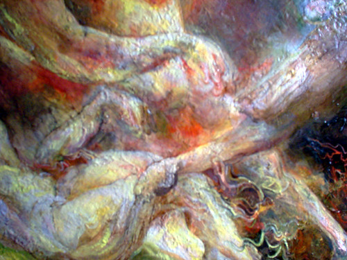
Like I’ve been working on this monster painting with lots of red and green and yellow. I remember thinking when I chose the palette that I wanted the red and green to rub up together in an optically awkward way. There’s too much yellow in it at the moment, I plan to make it more cloudy and moody. Then when I’ve finished it I’m going to do something I’m more in the moment and passionate about. This is a strange exercise in problem solving at the moment, but it is improving as I persevere.




Then there was that pink ink one which I’ve ruined by putting other stuff on top. But it will get better before it’s finished.


And the one with the wrestling and the orc and the by now familiar cat man… This one will look a lot different by the end too. This is more sandy. The other one was more wiggly. It’s got everything and the kitchen sink in this one.


Then the bat one, that has grown. It’s acquired some colour and some new pecs. This is part of my perverse wrestling imagery Chloe revolution reaching beyond the comfort based tyrannically cool school of imagery choosing and reaching toward the transcendent power of enriched vision beyond culture. And it has a bat.


I wanted to get to grips with the somewhat fascinating graceless rectangularity of John Cena, as those of you who vaguely follow the incoherent babblings of my grey blog may know. So I started drawing him, I started the big one in the bottom right corner wanting it to be purely done with coloured pencil since I hadn’t tried that for a while. But I felt I copped out when used watercolour and ink too. Also it looked too conventional or professional or something, not very interesting. Because he already looks like a cartoon or an action figure, there’s nothing clever about this drawing really. If there are elements of him which are unedifying, I wanted to try and make my drawings in some sense edifying despite the odds.


So what I did was I redid that entire page almost purely in coloured pencil, to see if I could take it to somewhere more interesting and uncover my purpose a little bit more.


In the top centre one, in his eyes I made him look a bit like me age three and apprehensive about being photographed. My motherly instincts and compassion seeped out, I couldn’t make him entirely hideous.

And working in coloured pencil took me back to age thirteen when they were my main medium. The memories were surprisingly potent. That was an age when I significantly started developing my own ‘techniques’, which had been a private milestone, I realised. I’m quite soft and gentle with them, which is interesting as a counterpoint to all the other media I’m using in less puritanical ways. I’m re-educating my seeing at the moment.

Friday, June 30, 2006

Bat Flash Jesus Ghosts

Well, I said summer blockbuster. Sometimes I think I promise too much, just for the sake of suspense. Do I think I’m Hitchcock? What a fool am I.


I went back to a big old painting.


The painting originally was going to have Janus and Paul Gascgoine (ex England football player famous for crying at the 1990 world cup) and a barn owl and Shirley Temple and Jesus and Andre the Giant. It was quite a scene. I thought I’d sort it out compositionally with my immense virtuosity. I was thinking wishfully.

I’ve done some fresh little studies in order to commit myself to this gazza janus temple project.

Here’s a little pink ink one. It’s alright but the subject is too weird for such lightness of touch, or that’s what I thought when I was looking at it. I want to experiment with layering stuff over the pink. When I planned these dense weird subjects, I always meant for some of the ‘resolution’ to come through the process of painting itself, as pretentious as that might sound.


Here’s the whole monstrous thing as it stands now. I think it’s salvageable. I’m getting good and impatient with it, like Delacroix.


The next one is a more involved study that will become something more like a painting in its own right. Quite drawing-heavy, and incorporating Randy biting Kurt’s arm but simultaneously possessed by an Orc.


Here’s a detail from the big one, a bad photo taken with flash. I put it in because I saw a little face in the bumps on the reflection then drew the little face on photoshop. It makes me remember how excited I can get about the potential of oil painting. I could illusion myself up some shine and have a whole alternative layer of shine universe on the surface, if I was committed to the idea.


Next here’s Randy and John with a friendly bat. This is unfinished of course. I’m trying to grow the fun of my wrestling drawings and not suppress these urges but make them beautiful.


Funnily enough I sent John Cena a myspace message today. He seems a good sort, but I hope he’s not upset by my depictions of him. They don’t tend to be especially pretty.

Next here’s a fragment of yet another version of the Janus monster painting, but bigger and rougher. One of the faces of the two faced god is Shirley Temple. Some of the scribbling and lumpyness felt meaningful at the time.


Lastly here’s some minor self portraiture, in which my eyebrows go on their own merry way. I was hoping to come up with something cute enough for a new avatar, but I’m not sure.


I want to get back into drawing with my isograph pens. But they are a real hassle. I realised today that I wasn’t the only one who experiences this because I read an interview with R Crumb in which he talked about his rapidograph pens (nearly the same thing) and how you have to endlessly coax them and shake them and take them apart and get ink all over yourself and wash them and stroke them and sing to them in lilting tones. But they do make a darned nice line, they handle in a way I like. As much as I love biros, bless their 27 pence socks.

I’m thinking a lot about Hogarth and Gillray and Cruikshank and the history of funny English draftsmanship.

Friday, June 23, 2006

Pink Sugary Inky Mouth Holes

I think I’ll sandwich some dodgy digiphotos of unfinished paintings between some nice new drawings. So here we go.

Here are some attempts at self-portraiture, done in pencil and I am occasionally getting impatient with pencils. But I still feel that I need to satisfy my meticulous urges and I learn from being all pernickety about the pencil drawings.

I was trying to illustrate the lopsidedness of my face. The right side of my face has shrivelled bones. Instead of a jaw joint it has a piece of my rib. It’s a long story.


Now here are some of the paintings in which I have used the ‘X Factor’ palette that I mentioned last time in the comments.

The thing is my digital camera is very cheap and the colours come out crude.


It’s hard to tell from that, but I have worked on this one. Oil paintings like this tend to go through distinct phases. There’s a phase when they’re new and fresh and they look all flushed with the glow of youth and potential and many an art teacher would shout ‘leave it alone’.


But I’m interested in potential so much as I am in trying to make perfect paintings. So often I want a more dense and finished finish, though not necessarily a smooth and polished one, so there are always tensions to resolve. But between the flush of youth stage and the point of ‘perfect finish’ there tends to be an awkward adolescent stage where it’s neither finished nor fresh and just looks a bit ungainly. That’s the stage Kurt’s neckhead’s at, not that you’d be able to tell from that picture.

It takes some concentration to keep the thing alive even with skin-disease-like levels of detail.

Click on the next little square to see Shelby, the unfinished internet pinup lady. She is holding her breasts.


Here’s some kind of sentimental angel:


This next (older) one might be my favourite of my uses of that palette. It’s different though, it’s oil glazes over layers of other media, in miniature:


Now here’s a fairly unedifying sketchbook page in which you can see my brain at work, also I was thinking through next oil palette options.

(You have to click on the tiny square to see the whole thing)


Now how could I let an entry pass without some great big sweaty wrestler faces.

This time Randy became an eggtomato, and as for Kurt, I think that because I felt so guilty for making him into Slimer I went overboard and made the most megacutesy sugar overload babyfaced kurts in the universe.

It did make me want to draw more in pink ink though. Like splatter it all over the place.


The pink Kurt looks like a fountain, he looks like water ought to start spurting out of his mouth hole.

Next time I might have begun to tackle my epicness epic painting desires. It’s time for something more like a summer blockbuster.

Friday, June 09, 2006

Spooky goat man variations and cartoonlessness

Here’s a little watercolour study of Kurt Angle done in the spirit of Turner. This one is FINISHED, I think. It’s teeny tiny.


But it turns out he’s really hard to draw. Here are some frustrated little studies. I will understand the shape of your head Kurt, one day.


Now here are a couple that have been nearly finished for a long time. (See my current grey blog entry for more on my nervous twitchy issues around finishing stuff.) These are still not finished, but on a screen that has less meaning. One is a softer more diffuse supernatural Randy Orton goat man (he needs more electricity though).


You might have noticed that I draw Randy Orton a lot. This would be difficult to deny.

One’s a slightly more rugged fluorescent Randy Orton goat man. I used a lot of white lines on him.

I was trying to incorporate some zeitgeisty graphical lighting inflections from game screenshots. Spell effects from RPGs and things. It seemed a wholesome way to attempt to be zeitgeisty.


Those are the at the spookier end of my idiom I reckon. Very dense and peculiar layering of materials going on here.

It’s nice to do two of something. It allows you to explore subtly divergent variations on an atmosphere.

I’ve got nothing very cartoony this week. It’s a shame. It’s one of the most challenging things to do well. Soon though. Soon it will come together.

Related Posts Plugin for WordPress, Blogger...